Health Care is Here
SF Health Network
Project Information +
Branding / Social Impact
Client: San Francisco Department of Public Health (CA, US)
Credit: Daylight Design
2017
Client: San Francisco Department of Public Health (CA, US)
Credit: Daylight Design
2017
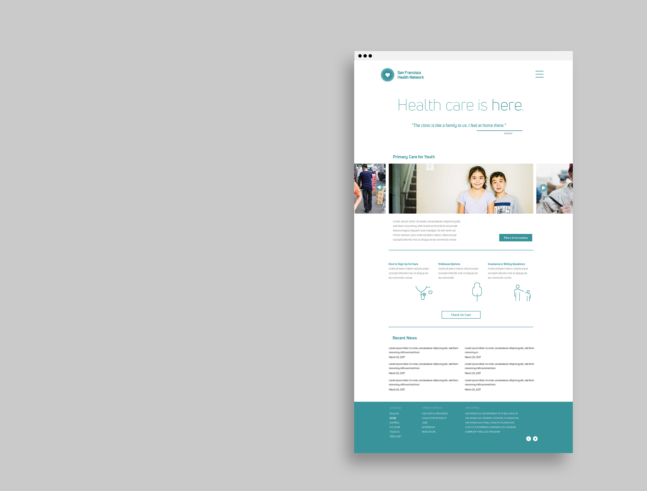
During our research, we spoke to over 40 San Francisco Health Network primary care patients from English, Spanish, and Chinese speaking communities; one consistent message was that the primary care clinics are viewed as an essential part of the community. There was pride in both the quality of care provided and the ease of access for community members. Our brand work focuses on promoting what patients told us is most important: "world-class care, near you, for you."
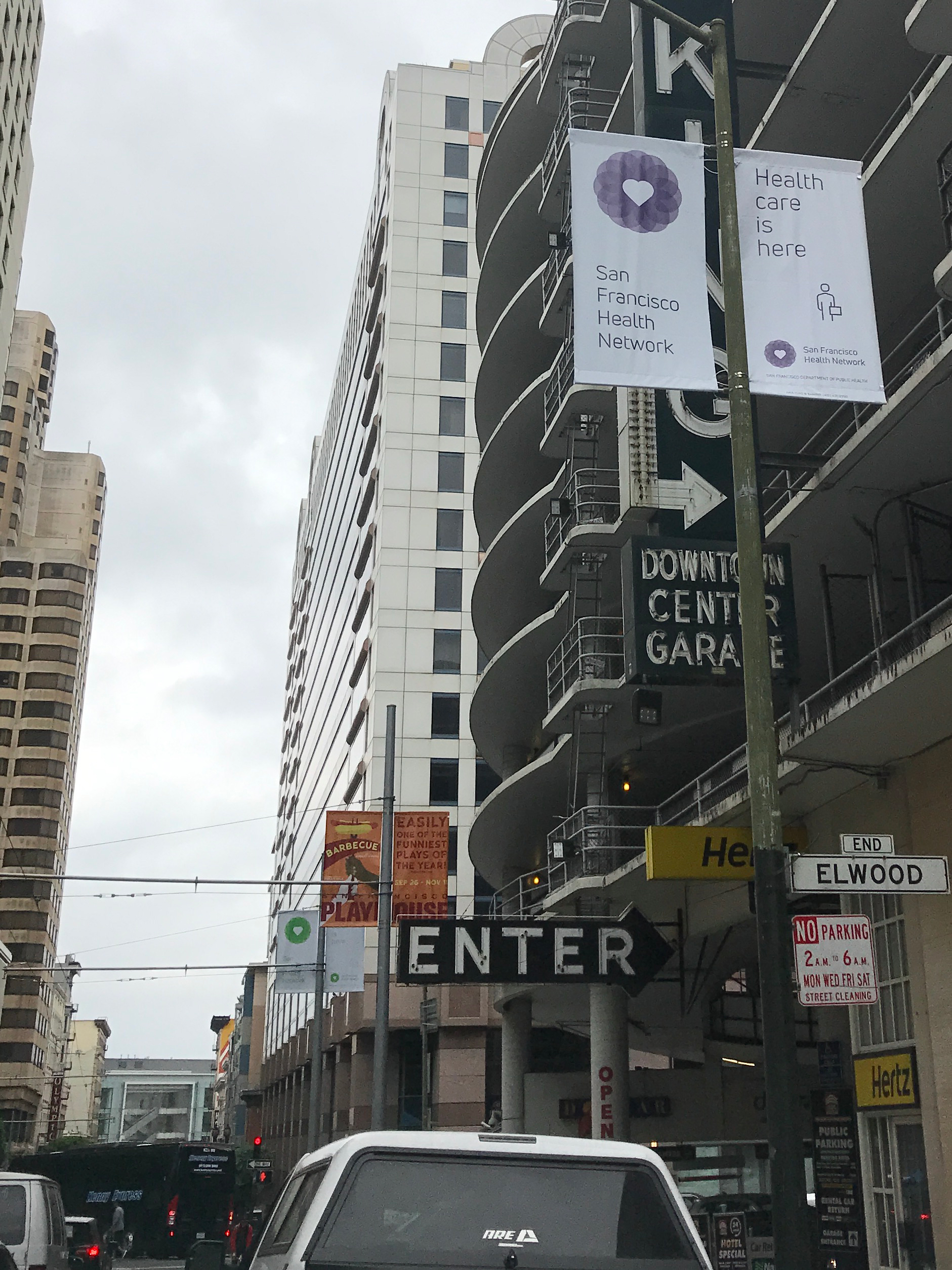
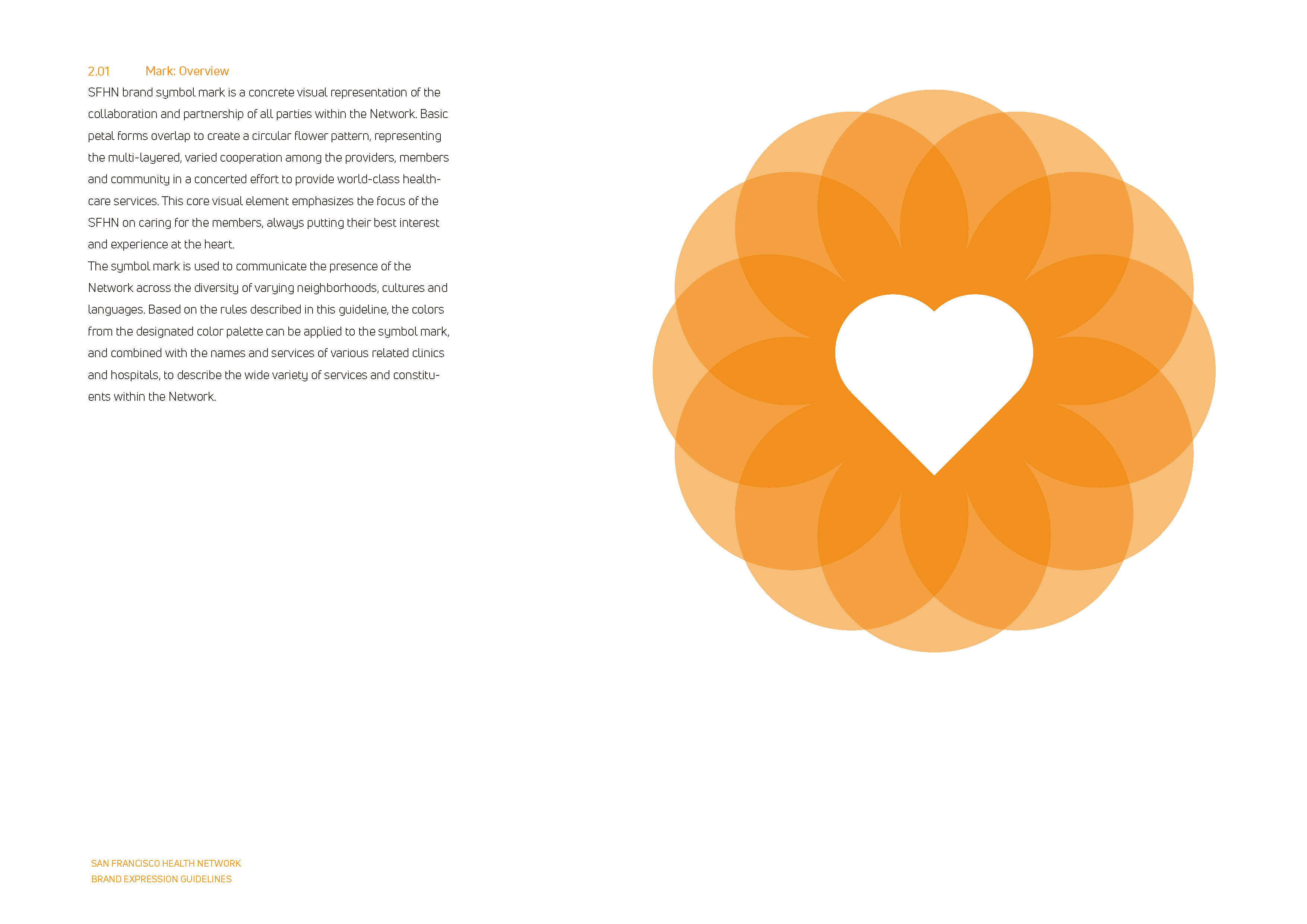
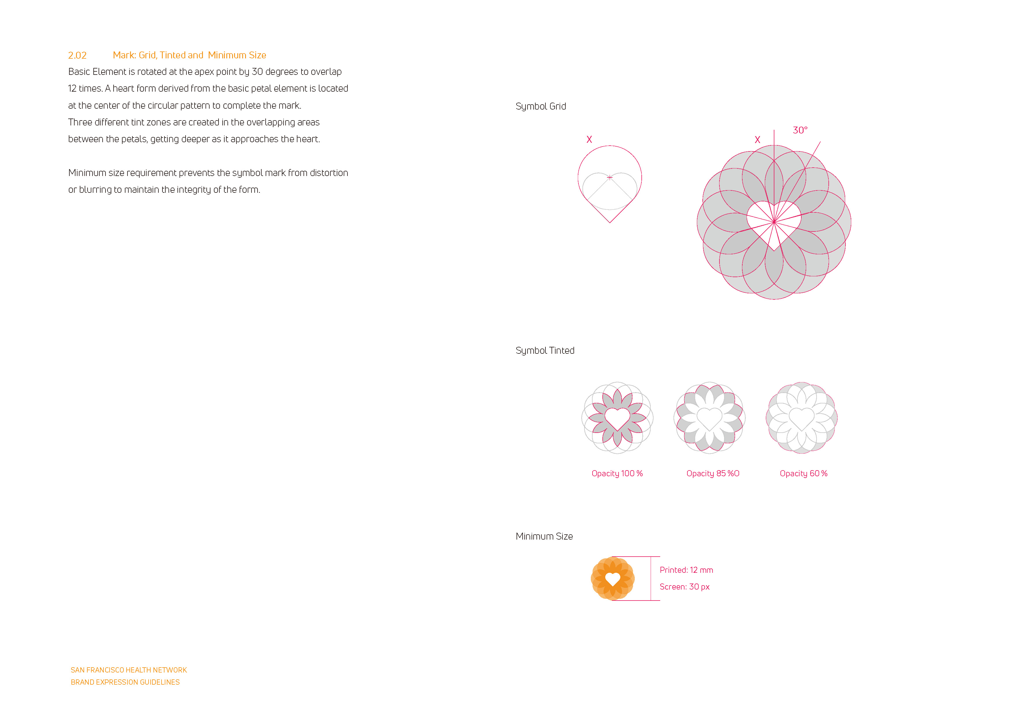
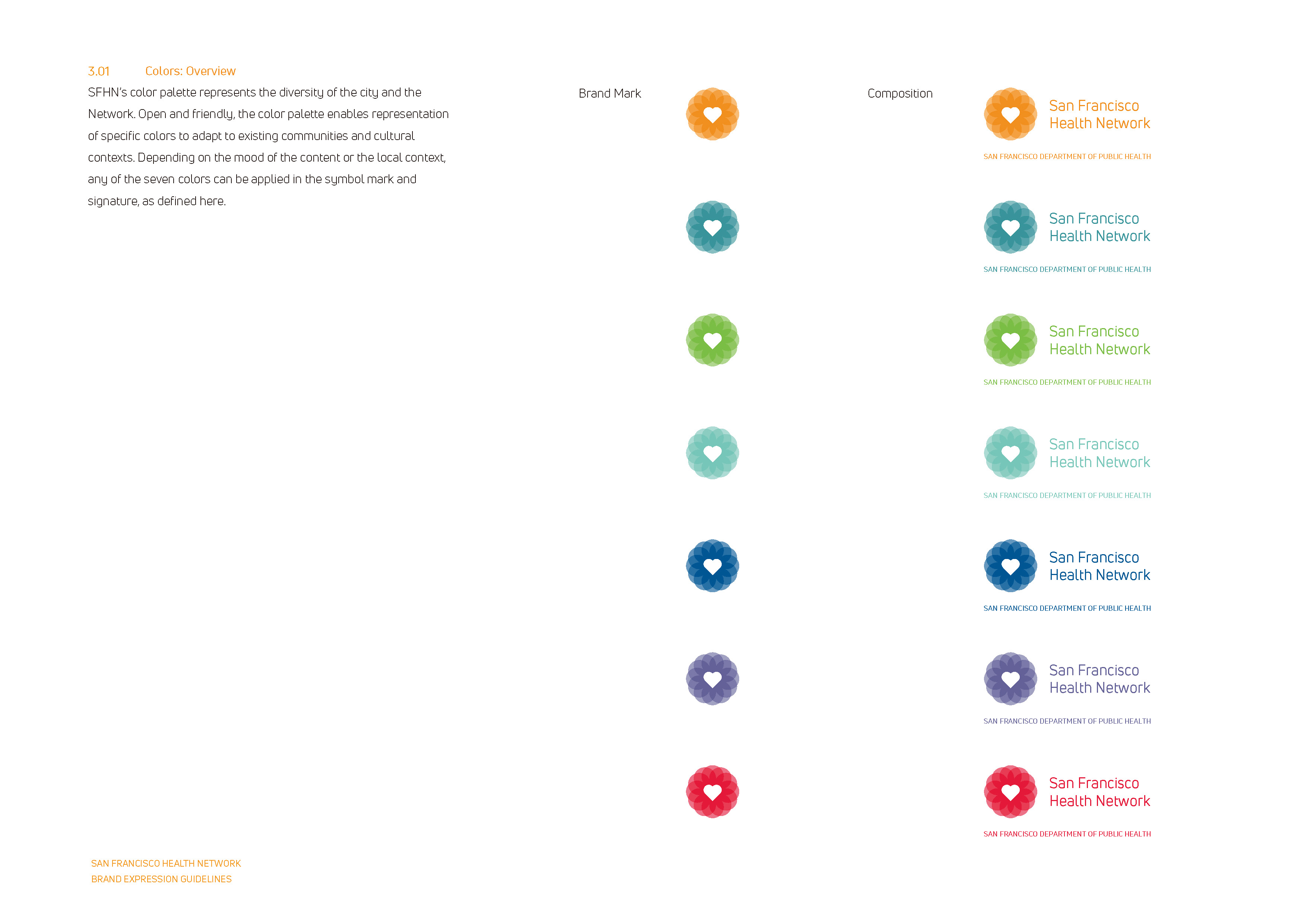
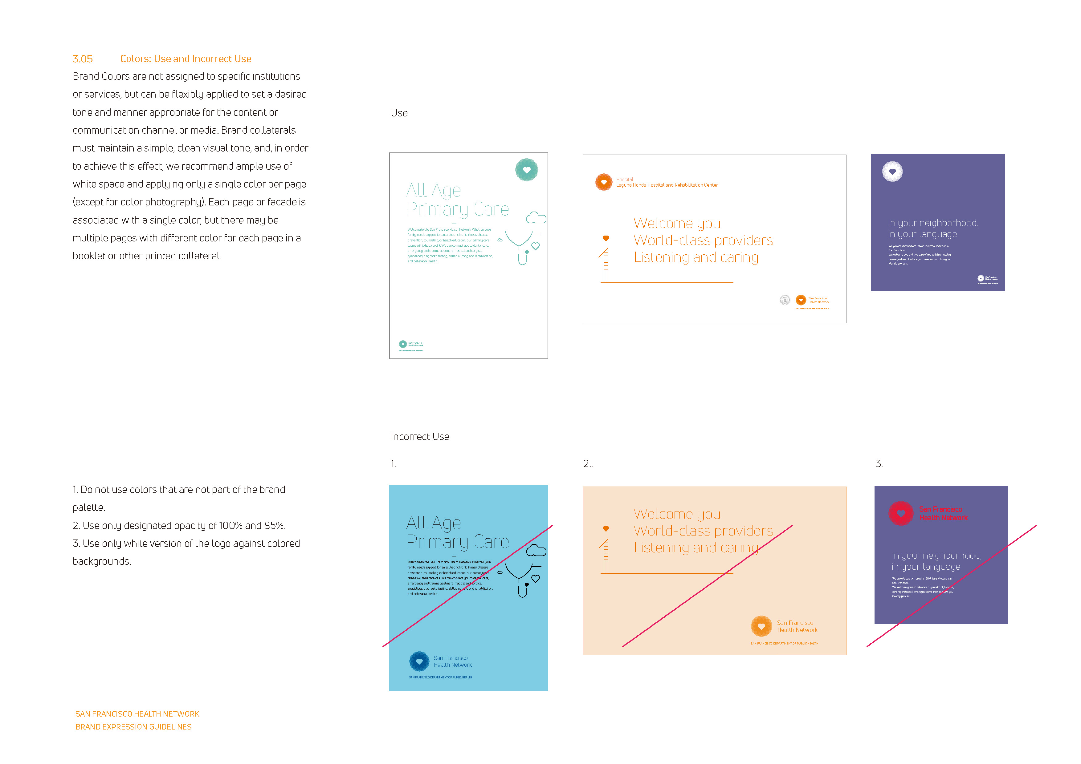
Using the patients’ perspective, the Network can now distill their mission (supporting patients wherever they are in life, in whatever language they speak, in whatever community they live in) into four words: "Health care is here." And the logo is now a heart and flower. The flower, with overlapping petals, represents the collaboration and partnership of all within the network. The heart at the center emphasizes our focus on caring for people, always putting their best interest first. We used multiple colors—seven of them—to celebrate the diversity of San Francisco.
The San Francisco Department of Public Health successfully launched the new brand at more than 30 care sites across San Francisco in August 2017.
Reference Article
Health Care is Here - Daylight
The San Francisco Department of Public Health successfully launched the new brand at more than 30 care sites across San Francisco in August 2017.
Reference Article
Health Care is Here - Daylight


ⓒ2024 hey-june.kr