Invisible promise and open possibilities.
Paramark Ventures
Project Information +
Branding
Client: Paramark Ventures
Credit: Daylight Design
2021
Client: Paramark Ventures
Credit: Daylight Design
2021
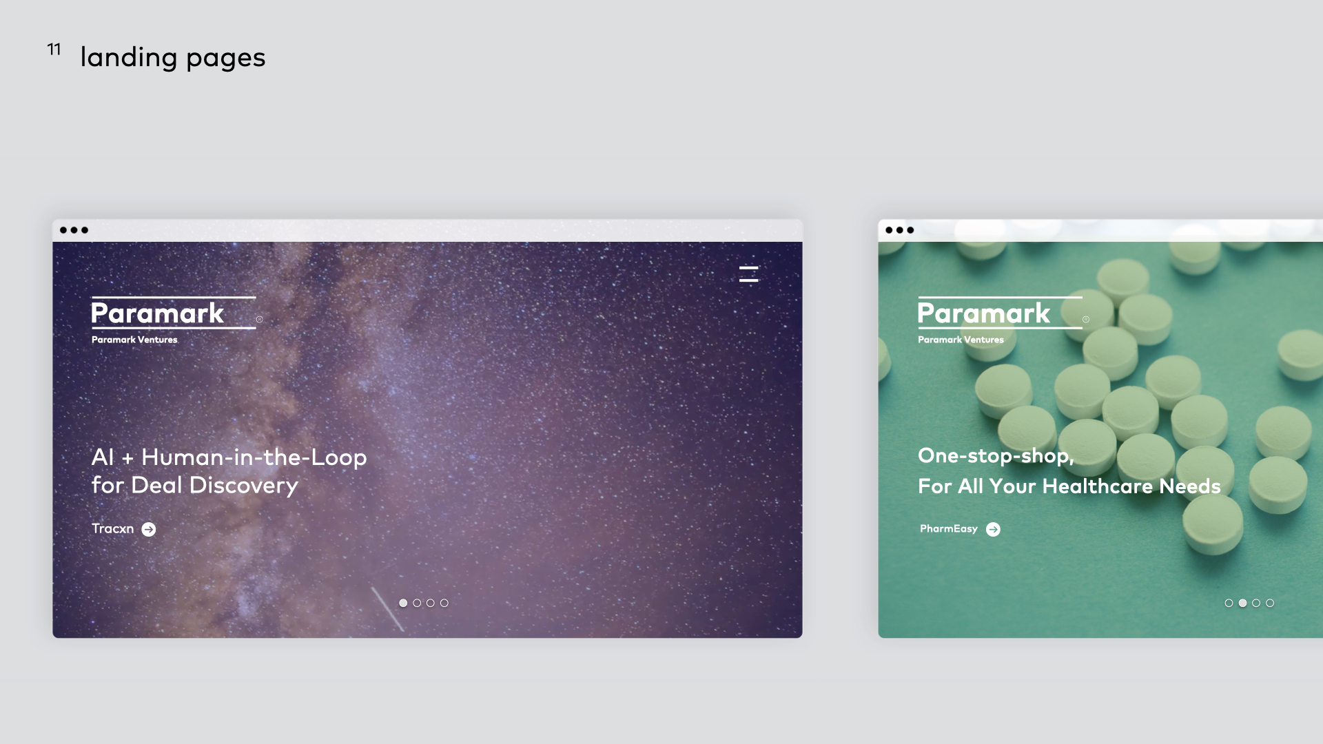
Paramark is a venture capital focused on investing in series-B round start-up companies in India.
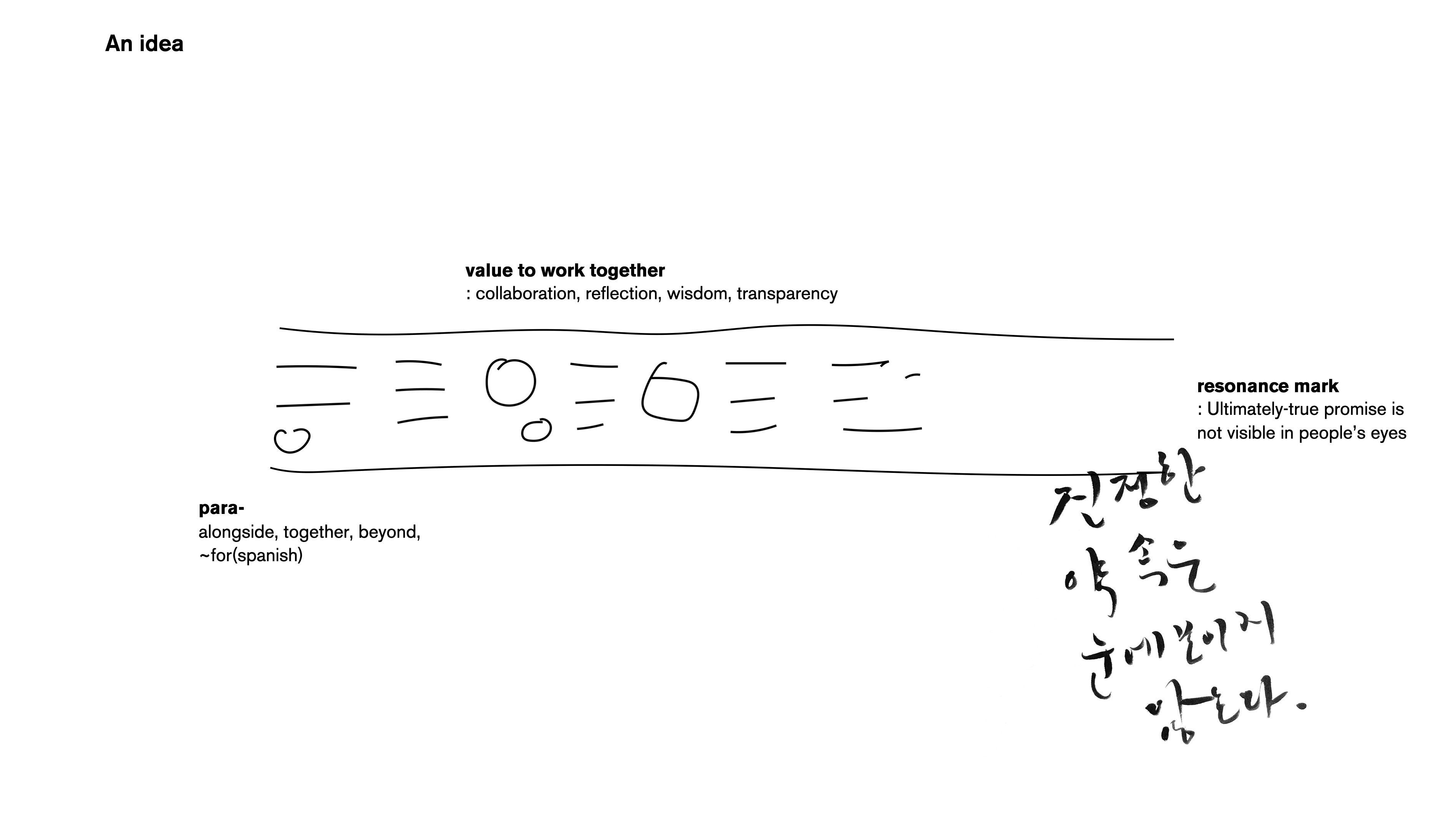
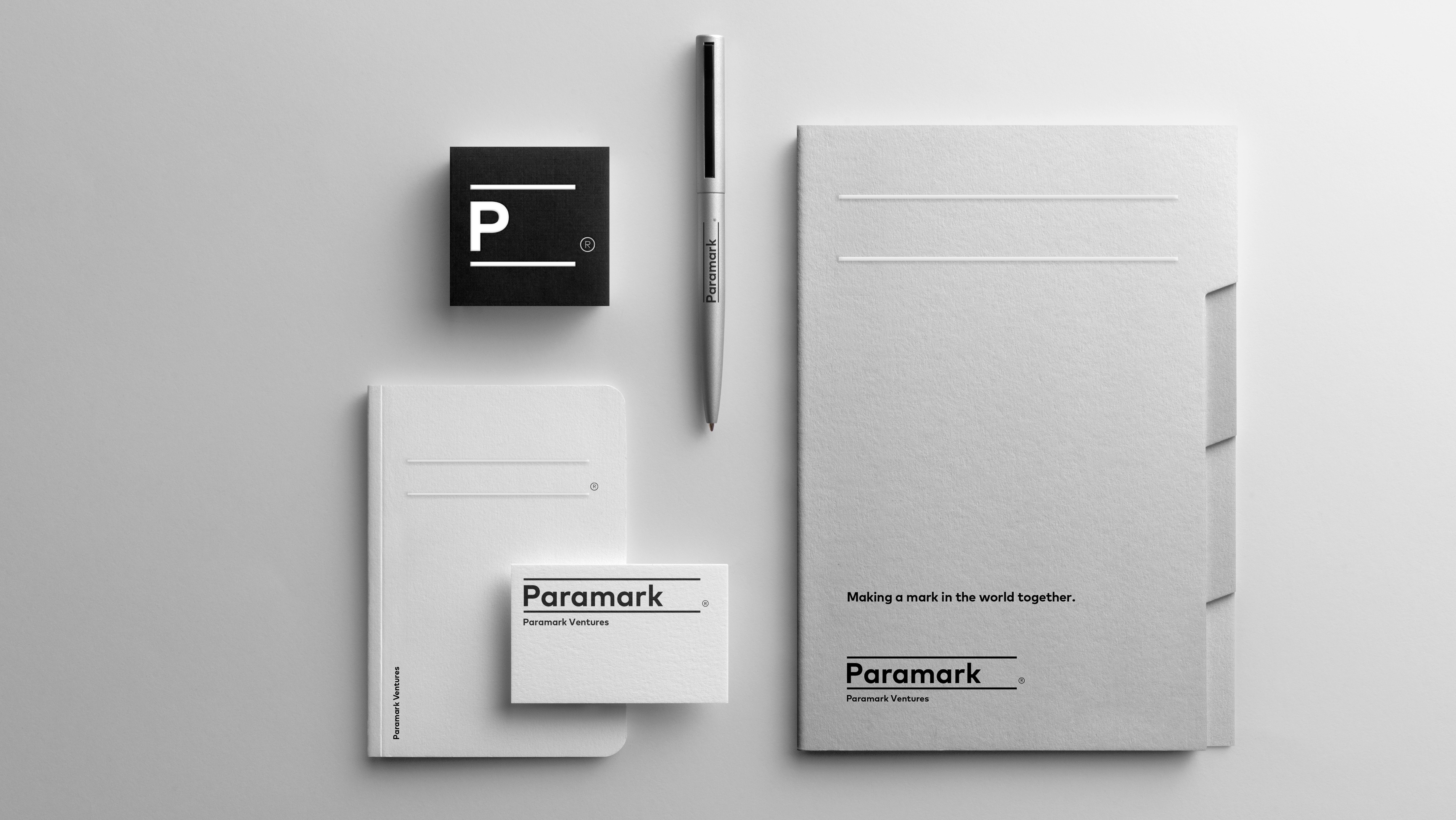
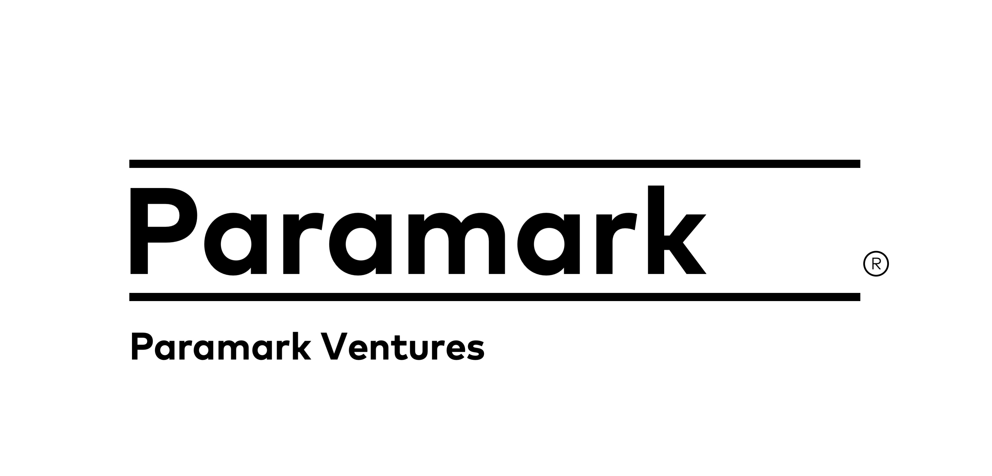
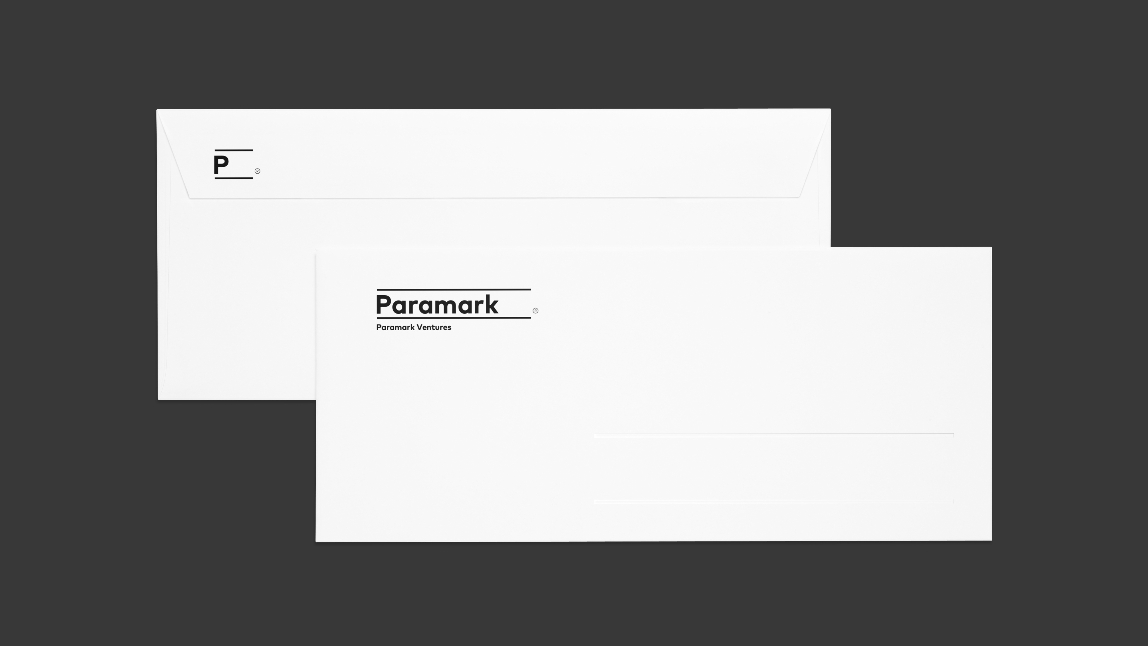
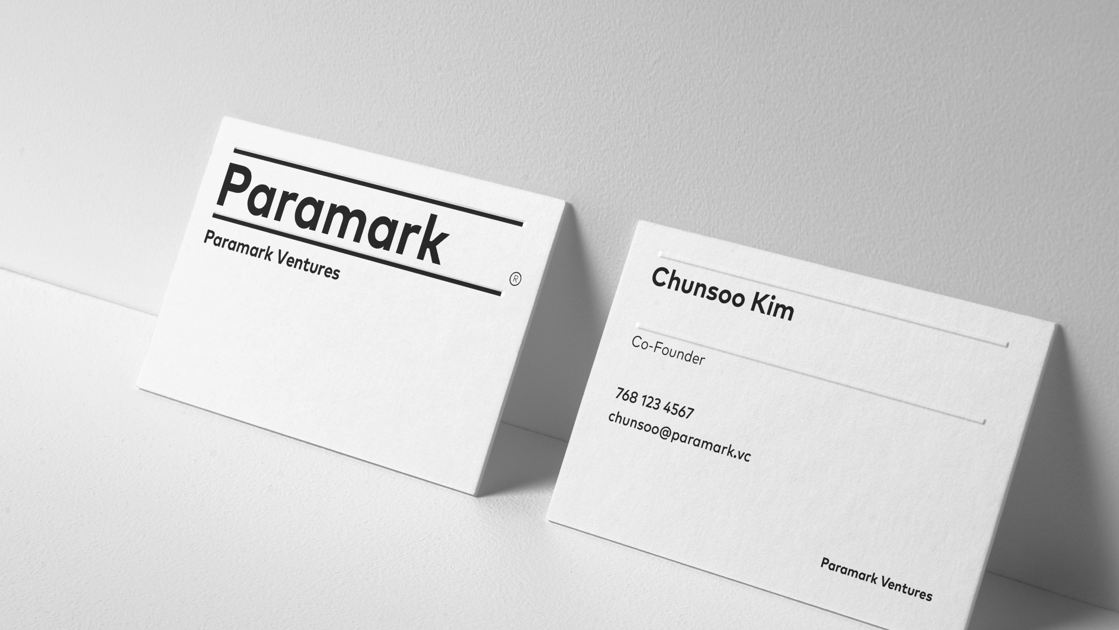
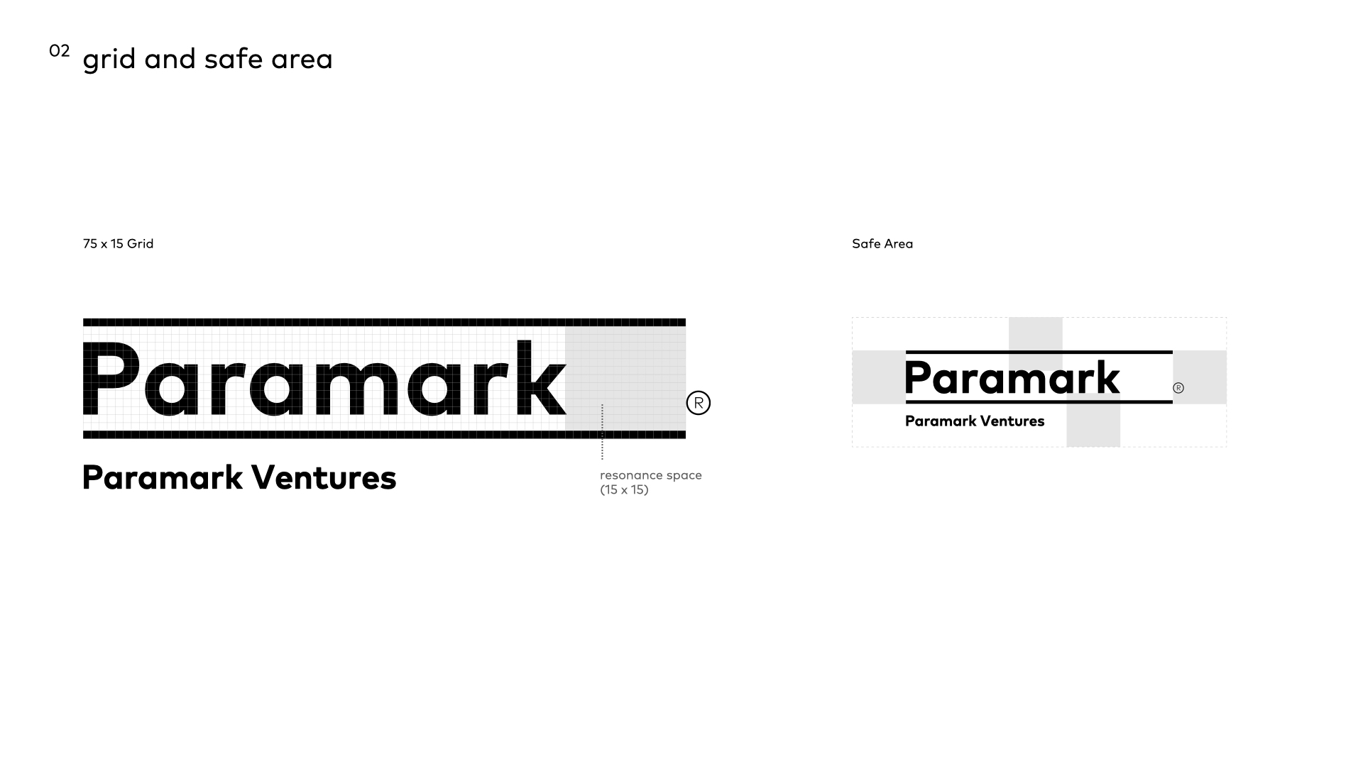
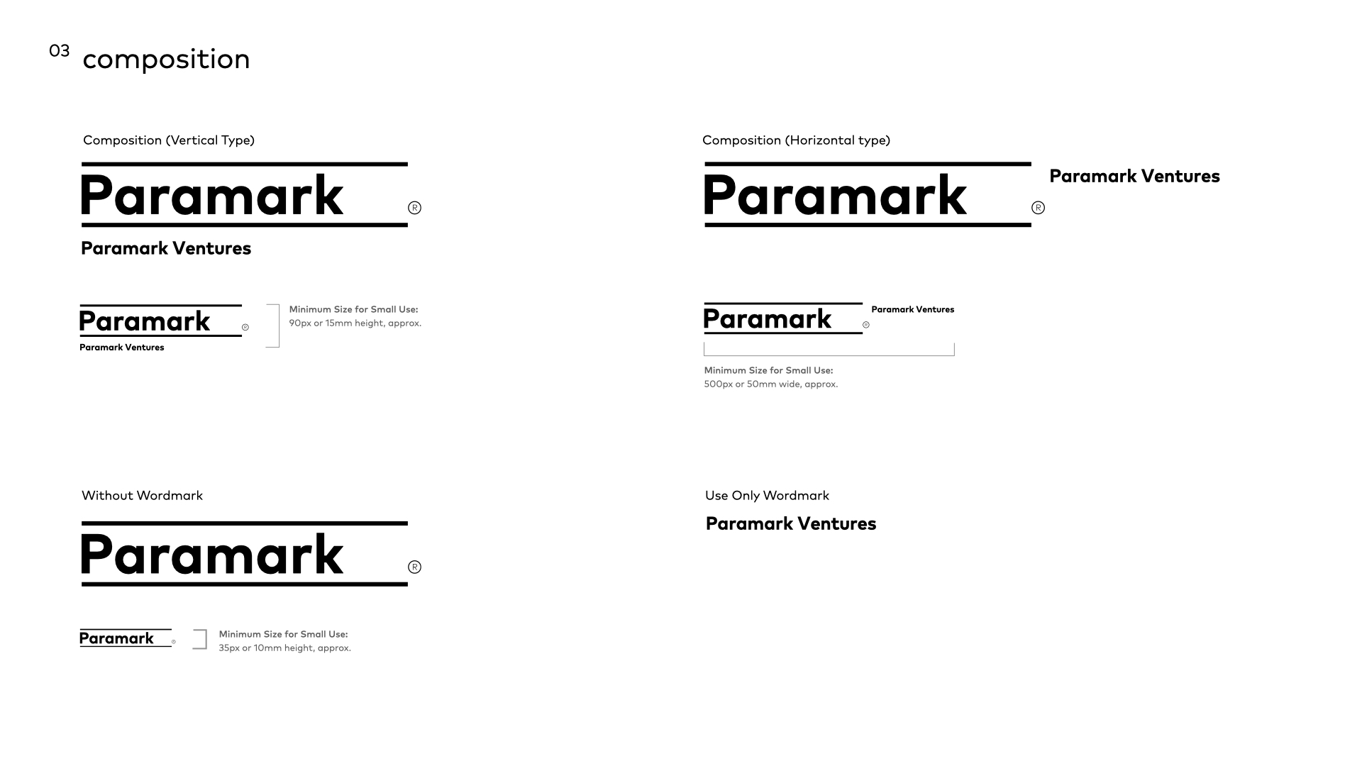
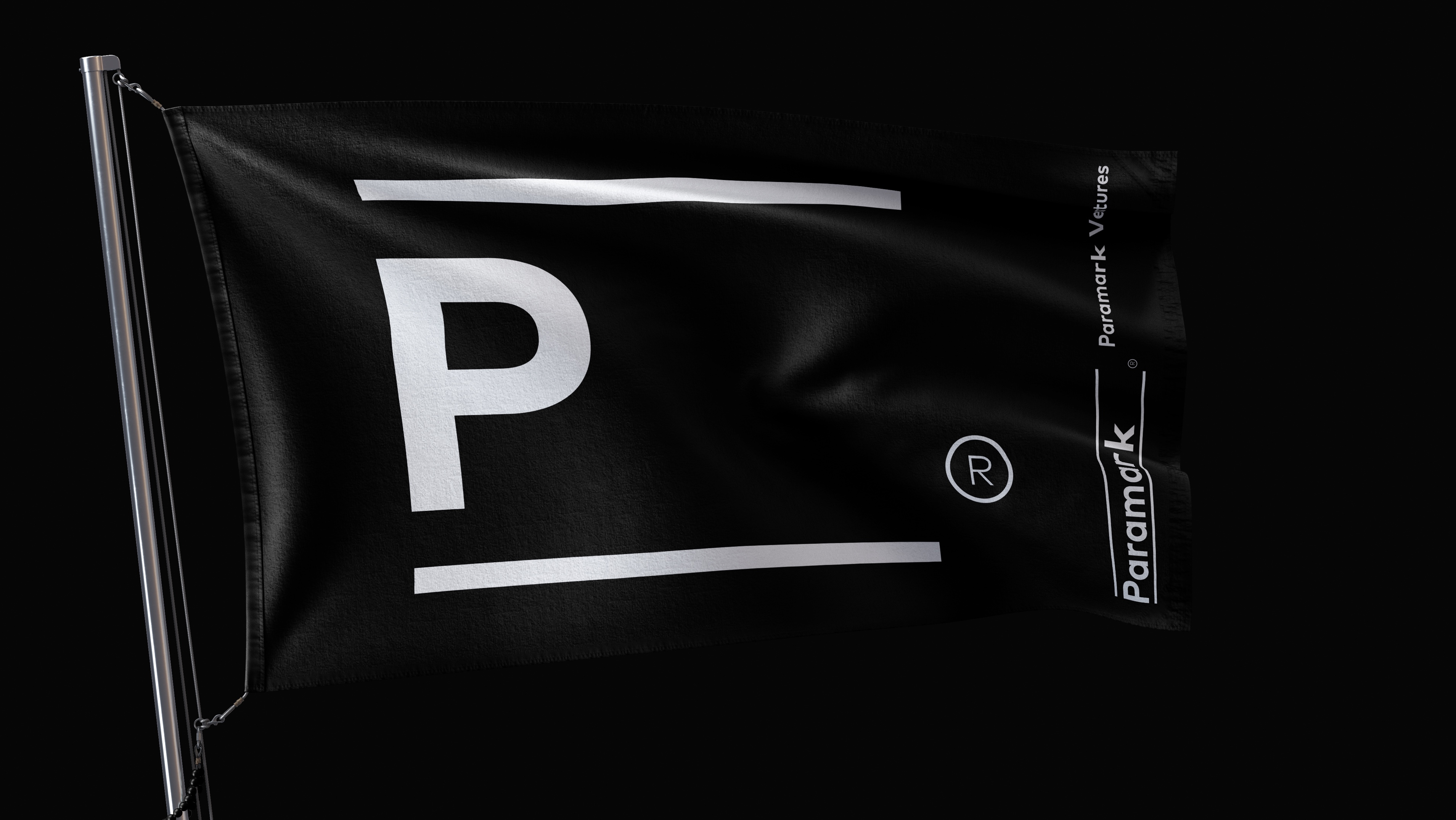
Paramark's logo type refers to the relationship and the promise between the venture capital company and start-ups. Two parallel lines imply a lasting partnership to make a mark in the world together. The empty space placed on the right side of the letters refers to the invisible promise and open possibilities.
The name “Paramark”, filling out the space in between the lines, much like a signature line of an agreement, represents a promise to both partners and shareholders of the role that Paramark will play: Bridging the parties with integrity and value.

ⓒ2024 hey-june.kr
