The Whole Note
Melon
Project Information +
Branding / Visual Interface /
Motiongraphic / Strategy
Client: Melon
Credit: Daylight Design
2014
Client: Melon
Credit: Daylight Design
2014
Daylight Design has developed a new brand identity for MelOn, Korea’s largest online music streaming service. The new brand identity is a system that fluidly links the music service with connections to artists, fans, lifestyle content and commerce. The renewal resulted in an extensible visual system that forms a strong foundation for Melon’s future vision and ambitions to become a truly connected music lifestyle platform.
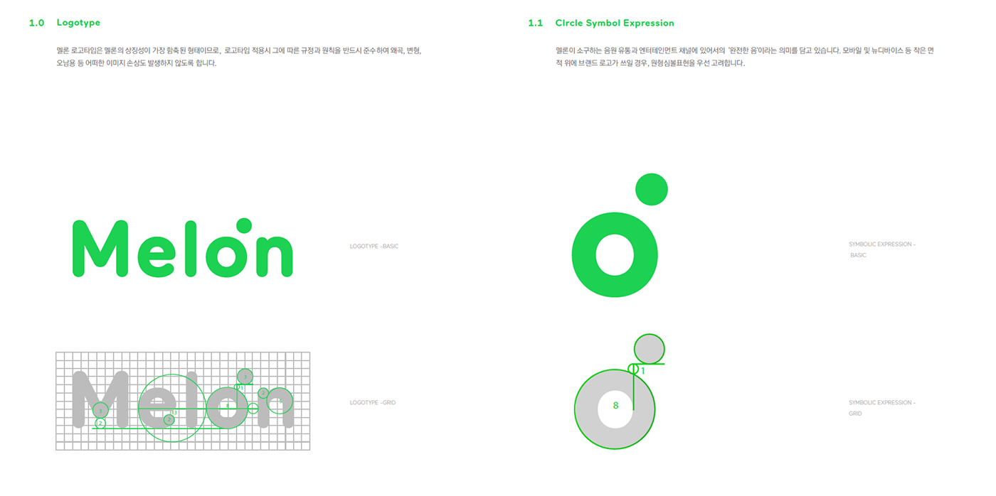
The letter ‘o’ serves as the visual motif for the ‘whole note’, which represents the service elements of music, connection, lifestyle and platform as a complete set. The dot icon references a musical half note, signifying a point from which the many possibilities around the ‘Connected Music Life Platform’ vision can take shape, as sub-brands and app services follows the same structure, with their icon replacing the dot.
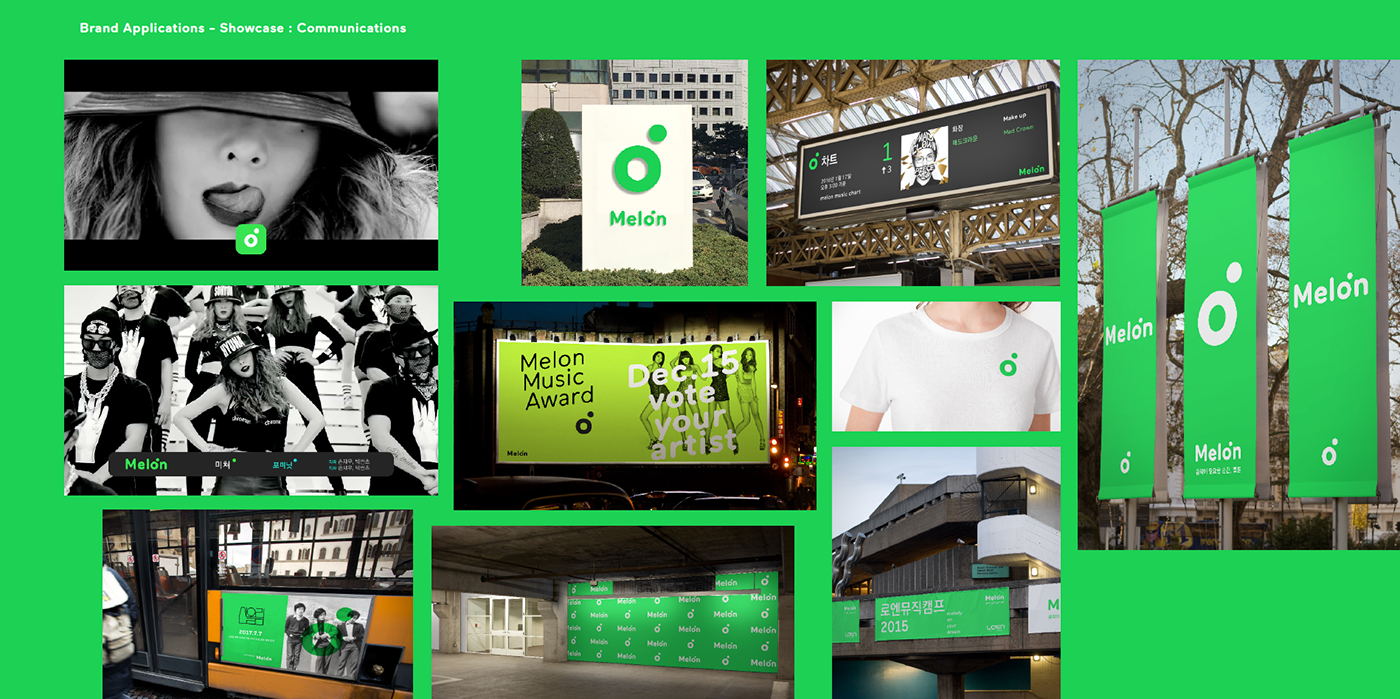
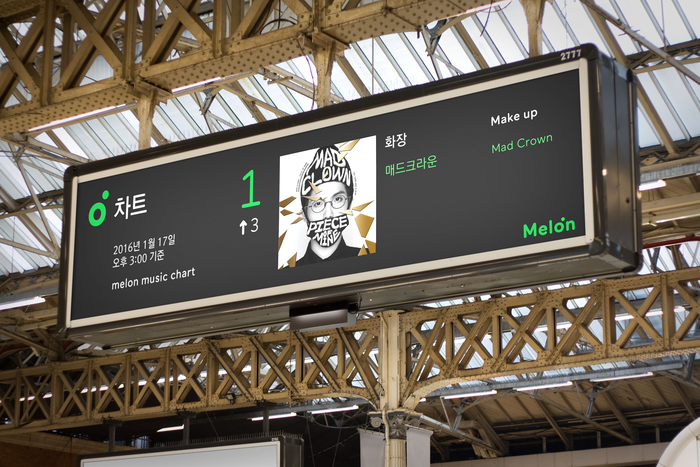
The new brand identity system visualizes the connection between the many different ways that we experience music and related contents. From consuming audio/video to connecting with fans, communities, and artists, the new MelOn brand has become a symbol that represents the online music lifestyle platform, which is an integral part of our lives.
The new brand identity system visualizes the connection between the many different ways that we experience music and related contents. From consuming audio/video to connecting with fans, communities, and artists, the new MelOn brand has become a symbol that represents the online music lifestyle platform, which is an integral part of our lives.
Reference Article
Transforming a music tool into a connected platform - Daylight
Transforming a music tool into a connected platform - Daylight







ⓒ2024 hey-june.kr
